Emails
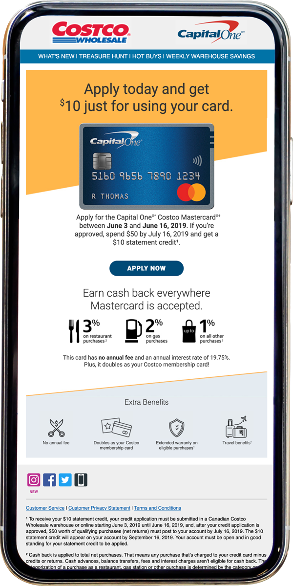
Captial One Special Offer
Every few months, Costco and Capital One put together a special introductory offer, previously we had pulled the design from a Costco Connection print advertisement. I had created this new design to look different from those Capital One designs that had a dark grey background. Since it is an offer that needs to be eye-catching and separate from the everyday material, I opted for a yellow design, with the card art as the primary focus.
* All links have been removed.
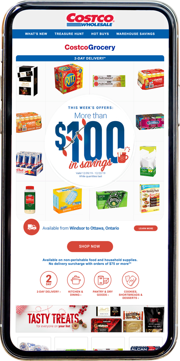
CostcoGrocery Weekly Email
Every week a CostcoGrocery email is sent to the full base with a different focus each week. This week was the theme of the products on sale. As CostcoGrocery is still relatively new the goal is to showcase the range of products offered through the delivery service. I developed this grid style to accomplish this. As the focus is on the selection, there is no need to show the individual prices off, which allows for an animated item rotation. In addition to the 16 products in the body, the hero gives us an additional 18 product spots.
* All links have been removed.
CostcoGrocery Weekly Email
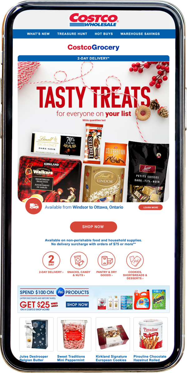
Every week a CostcoGrocery email is sent to the full base with a different focus each week. This email featured different Christmas treats on sale for the week of 11/23. Typically the directive is to show as many products as possible in the email hero; this week, I went for a flat lay style surrounded by some Christmas decorations with the text treated as it is sitting on the surface with the products. The hero is pieced together from the product shots from Costco.ca. There isn't time to put together a photoshoot, so I made the whole piece look like a photo taken together, by manipulating highlights and shadows to get this effect.
* All links have been removed.
Non Member Millennial Shopper
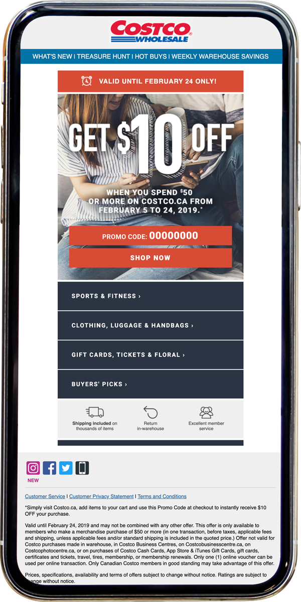
The goal for this email was to entice Costco members in the Millennial generation (ages 22-38) to shop on Costco.ca. The direction was to create a design optimized for mobile devices with graphics reminiscent of the Instagram platform. Working with the Project Coordinator, I picked Costco.ca categories that would appeal to the Millennial population ( experience focused categories like luggage for travel and gift cards to amusement parks). In my mock-up, I had also suggested expanding the benefits section to help portray how shopping on costco.ca is a smooth experience. The icons format can get the message across quickly at a glance instead of listing the benefits - as was done on previous emails.
* All links have been removed.
Email Fullfillment Template
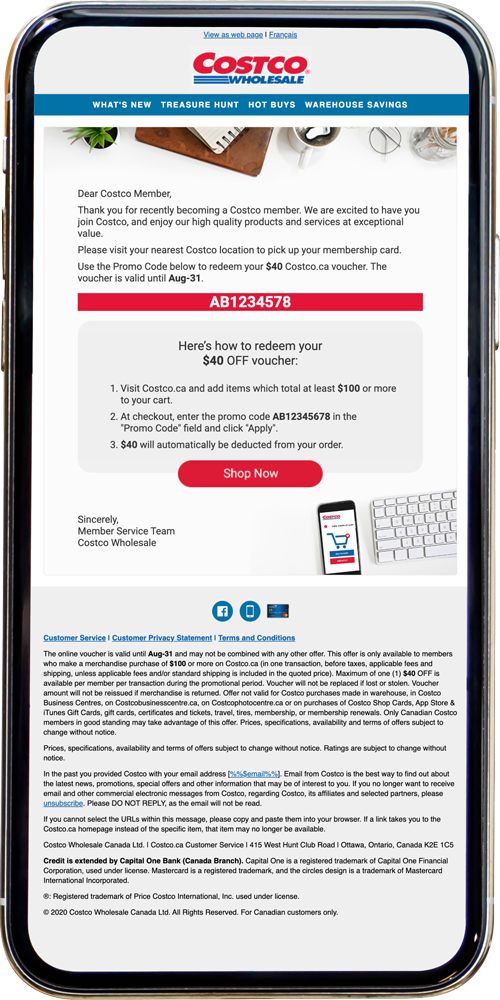
Over the past few years, Costco has been creating campaigns that required promo codes to be emailed to a member after signing up; they would then receive a Costco.ca voucher promo code. This method resulted in multiple fulfillment email templates to allow for all the promo-specific information. This year the project coordinator and I sat down to figure out how to generalize most of the text and the rest to be variable data. With that completed, I needed to create a template that was visually appealing, but generic enough to be used for a wide range of campaigns so that it could be used for years.
* All links have been removed.
Grocery Expansion
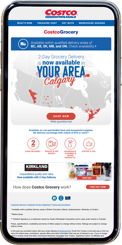
When CostcoGrocery expanded its delivery zone across Canada , it was completed in 2 stages. For the first stage, I created a map for a visual reference of the areas that would be covered by the service. We put together this email and targeted it to the members within the delivery zones. I knew that some of the major cities would need to be listed somewhere in the email, so I opted for an animation reveal, The design was loved, and we had updated it for stage 2's email.
* All links have been removed.
Re-engagement Email Offer
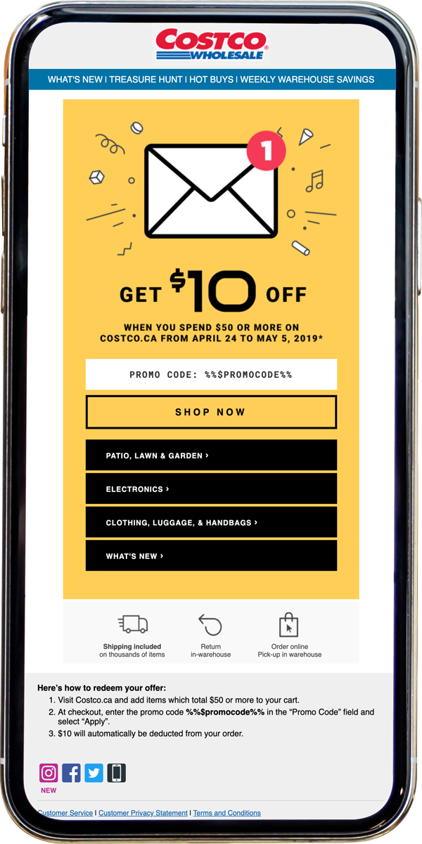
The re-engagement email targeted members who haven't interacted with Costco.ca emails in six months but had made purchases on the site before. Since these members haven't engaged with our emails for a length of time, I specifically created this email to look different from our regular merchandise emails. I lifted the layout from the Millennial offer email and opted for a vector illustration versus the lifestyle images Costco typically uses. Paired with the bouncing notification animation on the hero, the email was to catch the attention of members who had gotten tired of the typical Costco email.
* All links have been removed.
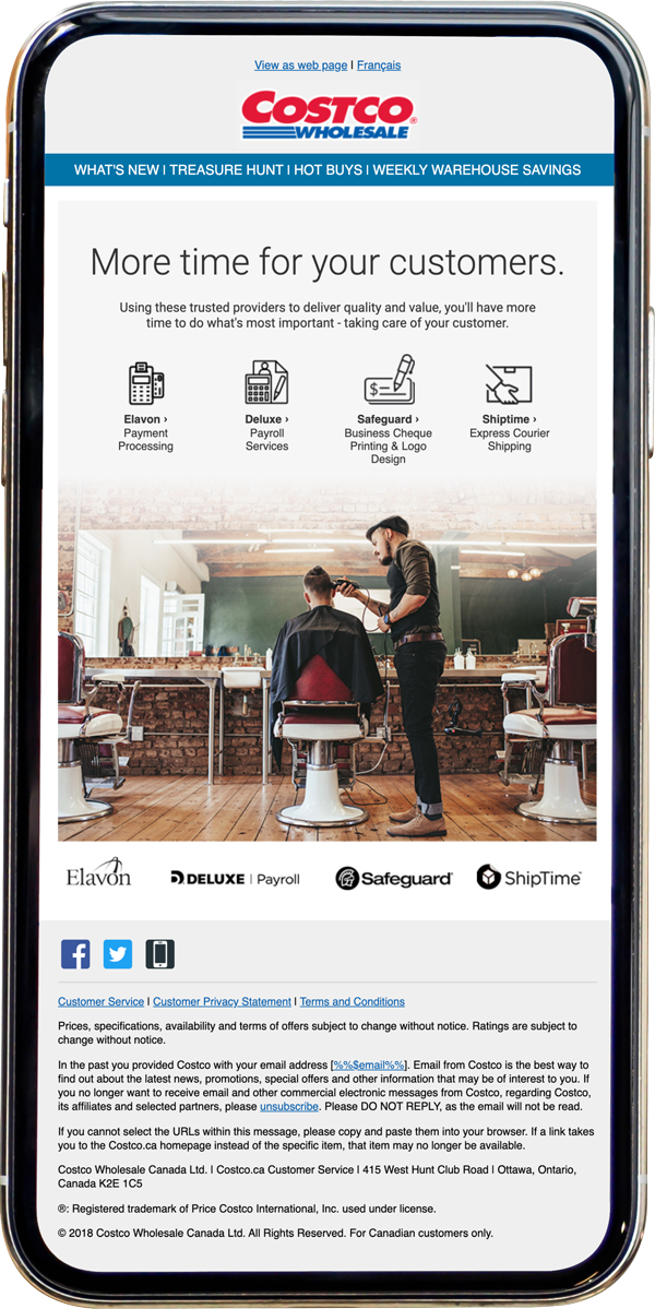
Small Business Sevices Email
Typical multi-services emails list all 22 services in a series of small banners, including any promotional text. This formula has been in use for years. I had suggested we try breaking up the monthly emails into targeted groups, like families or small businesses. The idea was to have more room for a more directed push of the services with supporting copy. The concept behind Costco's standards is to showcase how the member can use products; the new email direction was designed around this standard. During the mock-up, I had planned it around the concept of 'let Costco worry about the other things so you can focus on your business and its customers" the copy was put together after this idea was greenlit.
* All links have been removed.
